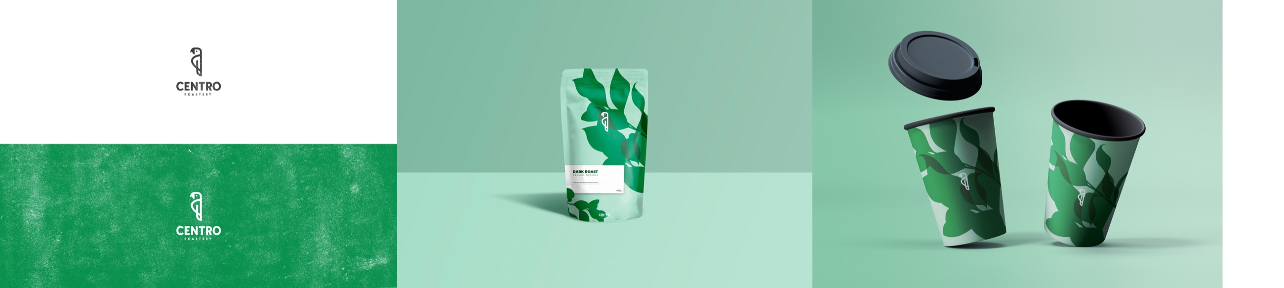
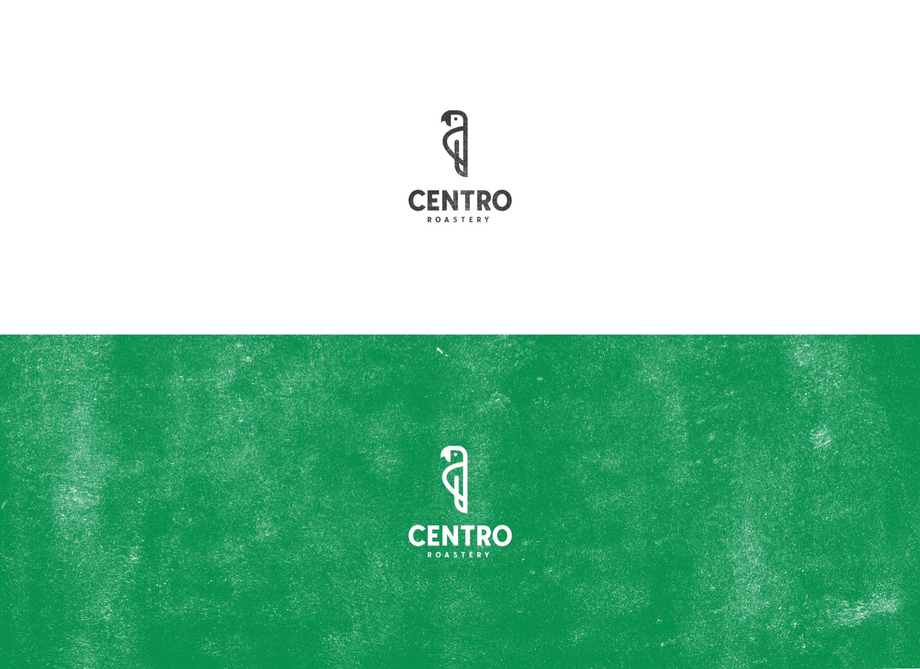
The Centro Symbol
A compact organic mark gives the brand a recognizable signature and remains legible as both a primary logo and a small packaging detail.
A fresh specialty-coffee identity translated into a coherent packaging and takeaway system.
KADD worked on brand identity, packaging & graphic design for a client in the coffee & hospitality sector. The project connected strategic clarity, practical implementation and a coherent customer experience for the organization’s market and location.
Related KADD services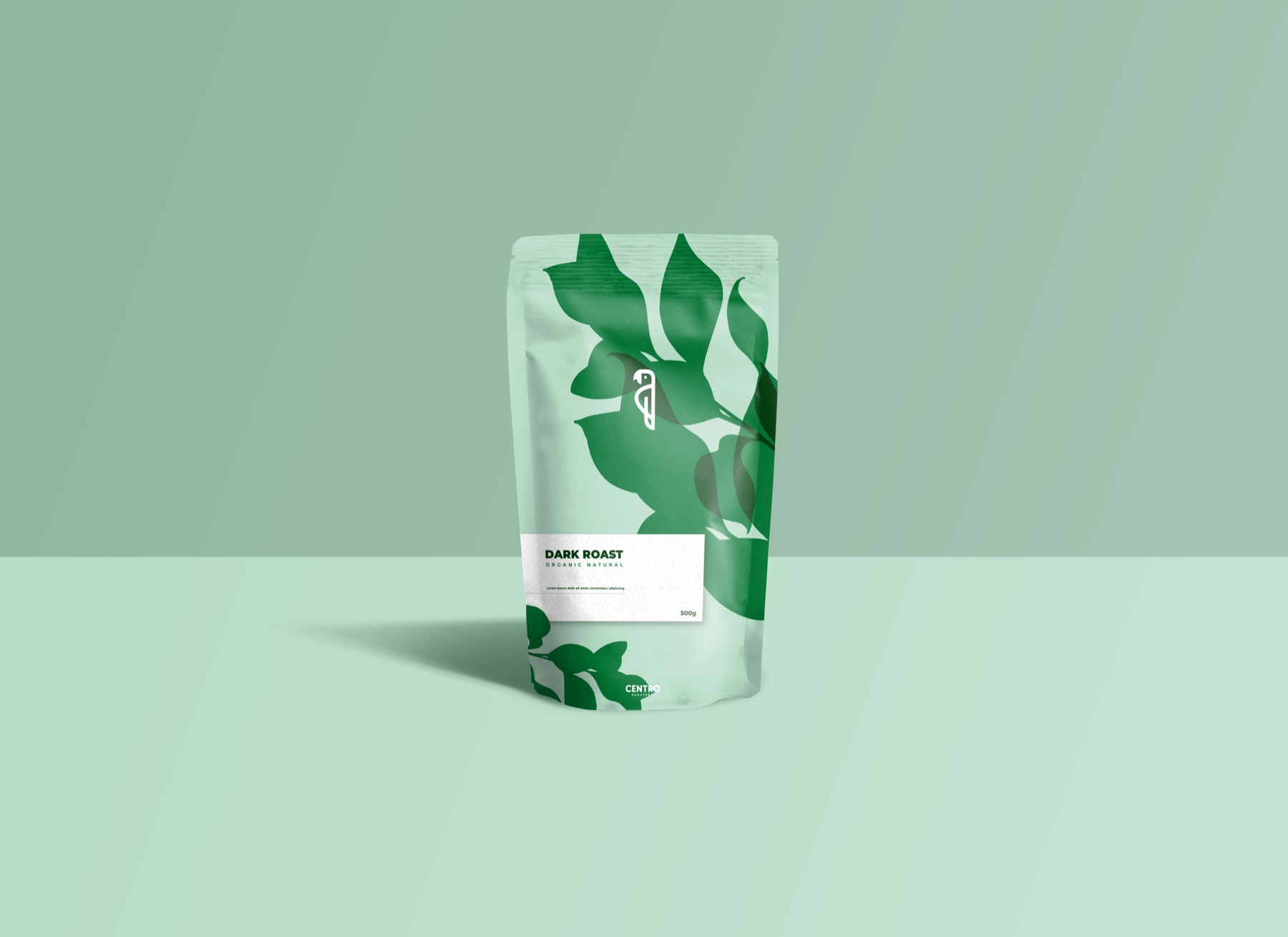
Centro needed a distinct identity for a specialty-coffee offer in Alba Iulia: contemporary enough to feel relevant to an urban audience, yet warm and organic enough to remain connected to the product and its origin.
The identity also had to remain clear on very different surfaces. Logo, coffee pouch and takeaway cup each impose their own hierarchy, production constraints and viewing distance, so the design needed a flexible visual language rather than a single fixed composition.
A compact organic mark gives the brand a recognizable signature and remains legible as both a primary logo and a small packaging detail.
A focused green palette creates freshness and distinction while supporting both bold leaf compositions and quieter monochrome applications.
Botanical forms, patterns and clear information zones allow the system to move from coffee bags to takeaway cups without losing coherence.
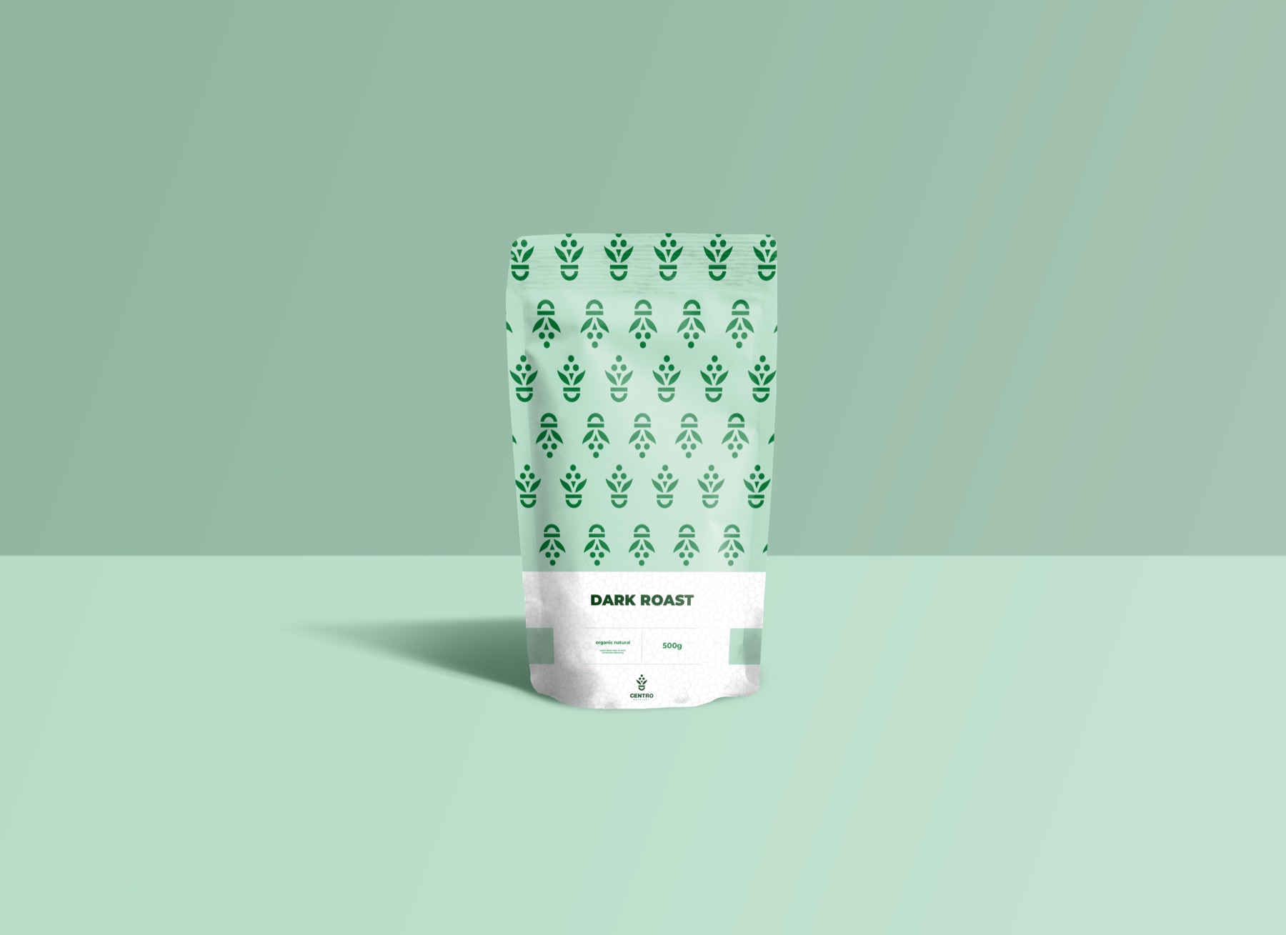
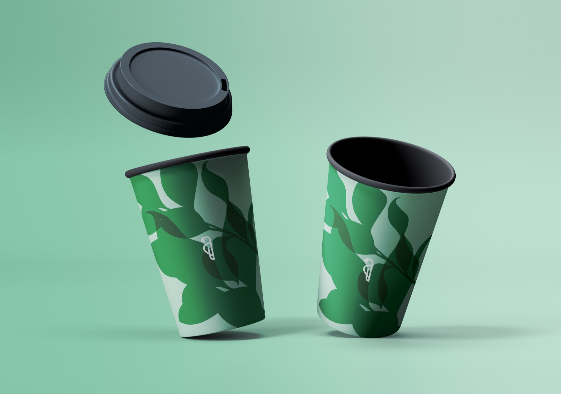
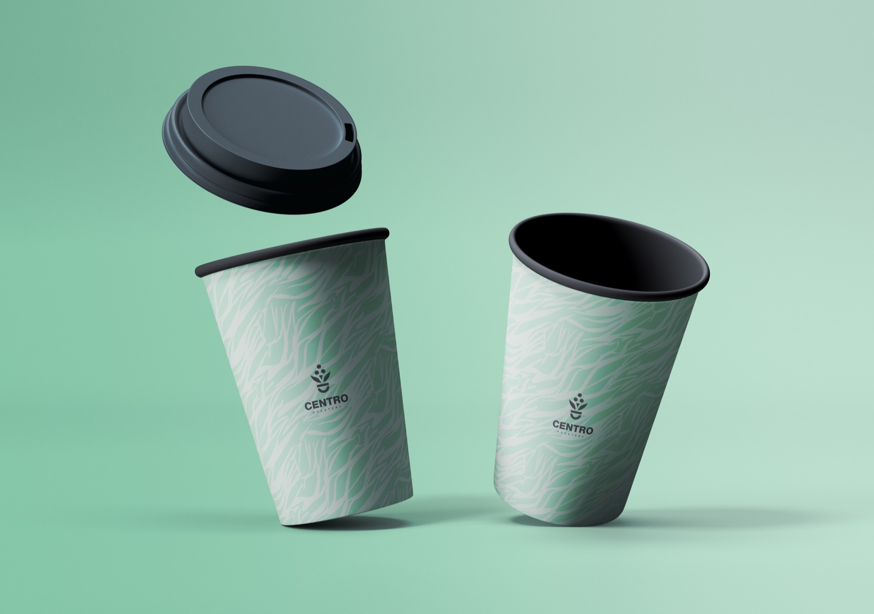
The completed Centro system combines an ownable symbol, a controlled green palette and flexible botanical graphics. The supplied applications demonstrate a coherent brand from packaged coffee to takeaway service. No commercial performance claims are presented without validated client data.