A Romanian Name
“Vrednic” describes someone hardworking, capable, worthy and fit for the task. Its cultural resonance gives the platform positive character before any explanation is needed.
Naming, identity and responsive marketplace design for a Romanian micro-jobs platform built around capable people and everyday mutual help.
KADD worked on naming, brand strategy, visual identity & product ux for a client in the marketplace & gig economy sector. The project connected strategic clarity, practical implementation and a coherent customer experience for the organization’s market and location.
Related KADD services
The platform needed to connect people who require help with people capable of completing practical tasks. Its identity had to feel credible to both audiences and translate a digital transaction into a familiar, dignified human relationship.
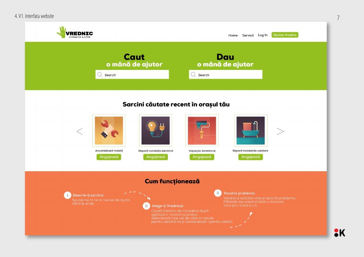
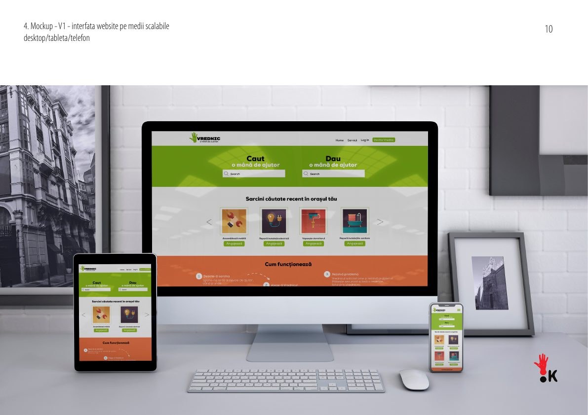
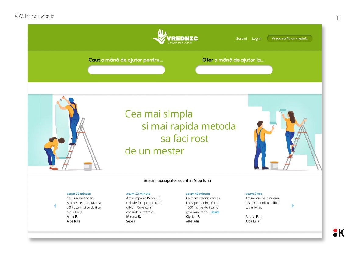
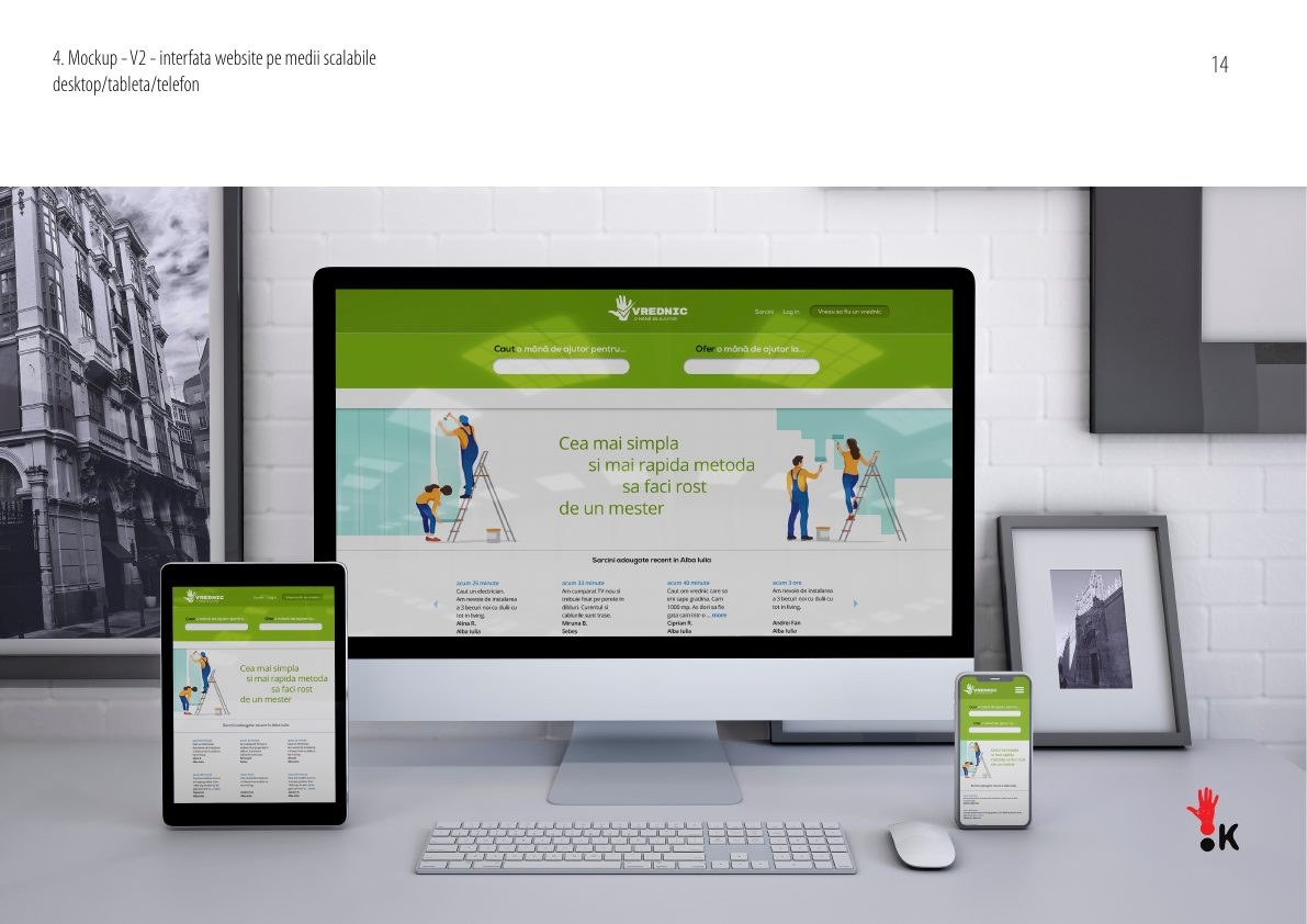
The brand also needed to extend directly into the product interface. Search, offer and service categories had to remain clear on desktop, tablet and mobile while preserving a distinctive Romanian voice rather than copying the anonymous language of global gig platforms.
“Vrednic” describes someone hardworking, capable, worthy and fit for the task. Its cultural resonance gives the platform positive character before any explanation is needed.
The slogan bridges request and offer. The hand becomes the unit of action, the symbol of skill and the natural connection between the person asking and the person helping.
Two interface directions were designed and applied across desktop, tablet and mobile, with clear paths for “Caut” and “Dau” and a scalable structure for service categories.
Vrednic turns a service exchange into a human story of skill and mutual support. The identity is memorable because every element follows one logic: a worthy person, a helping hand and a product experience that makes both asking and offering straightforward.