Recognizable Brand Mark
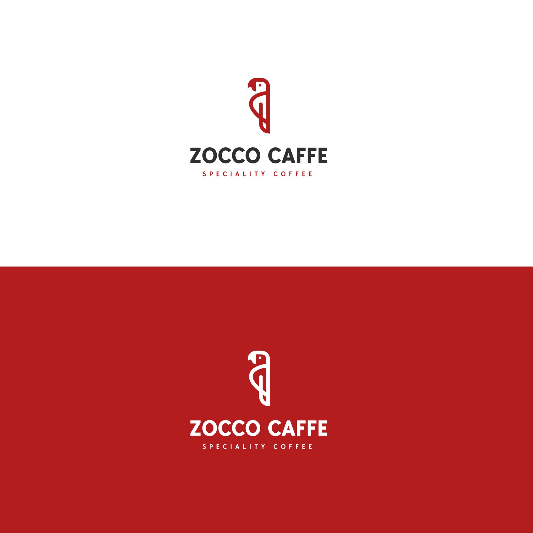
A compact, bird-like symbol gives Zocco a memorable signature that can work independently or together with the wordmark in both positive and reversed versions.
A bold specialty-coffee identity built as a flexible system for packaging, takeaway cups and everyday brand recognition.
KADD worked on visual identity, packaging & graphic design for a client in the specialty coffee & retail sector. The project connected strategic clarity, practical implementation and a coherent customer experience for the organization’s market and location.
Related KADD services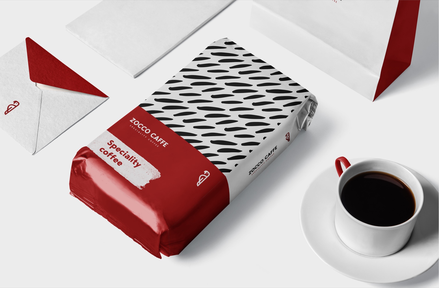
Specialty-coffee packaging often relies on the same craft cues, muted palettes and technical language. Zocco needed a visual identity that could feel immediate and contemporary while still supporting clear product communication.
The system also had to move confidently between very different formats — from the main logo and coffee pouches to takeaway cups, stationery and compact brand applications — without losing recognition.
A compact, bird-like symbol gives Zocco a memorable signature that can work independently or together with the wordmark in both positive and reversed versions.
A disciplined high-contrast palette creates immediate shelf visibility and gives the brand enough flexibility to alternate hierarchy across packaging variants.
Expressive repeated marks extend the identity beyond the logo, creating a recognizable surface system for coffee bags, cups and supporting materials.
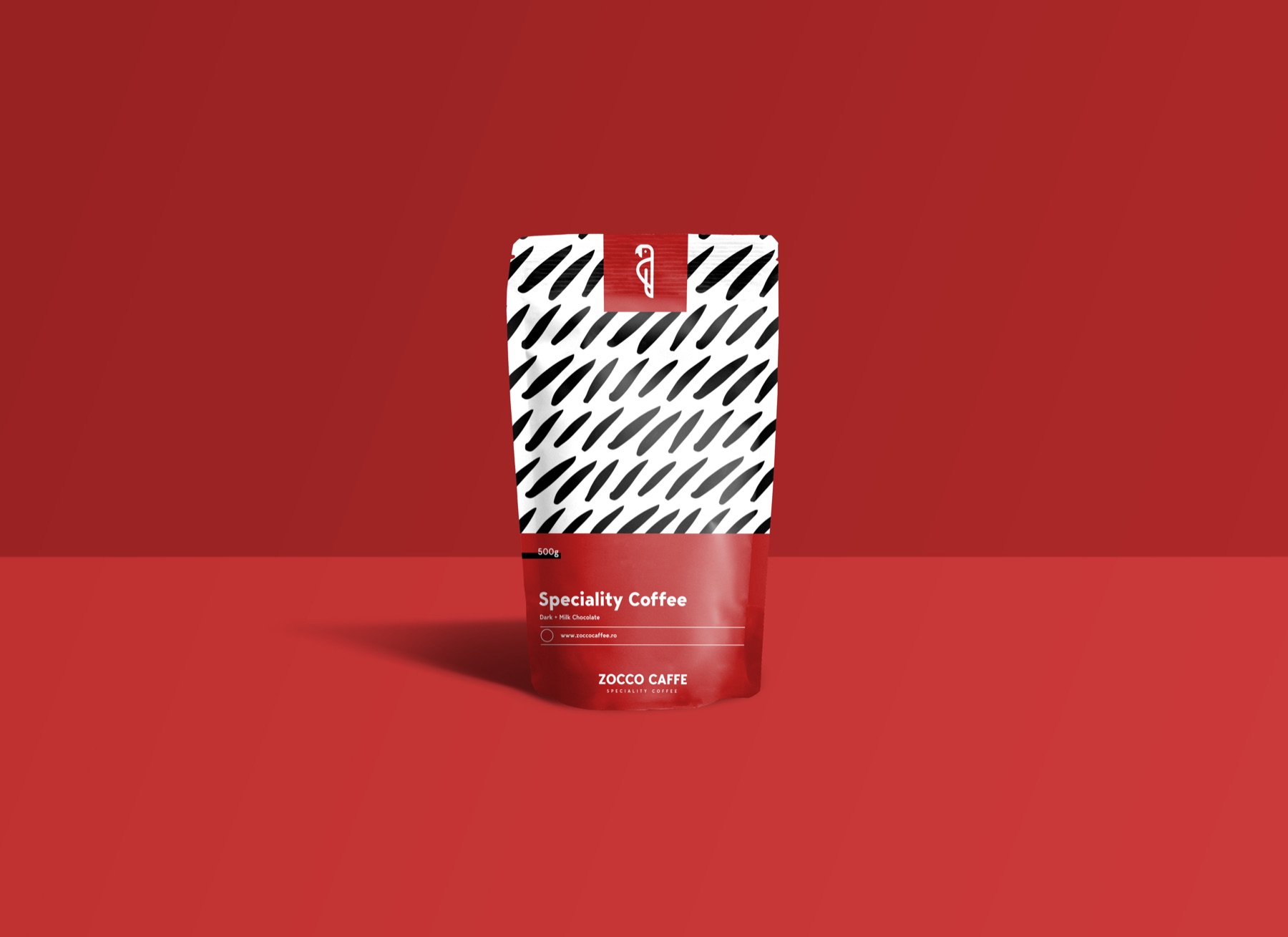
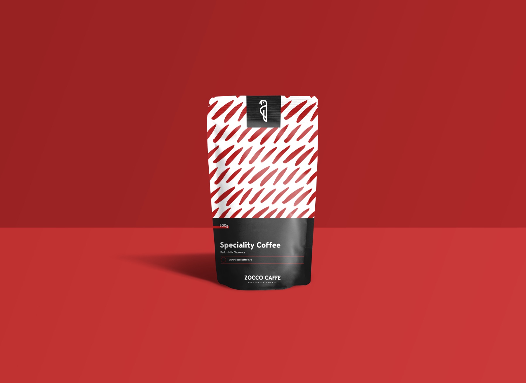
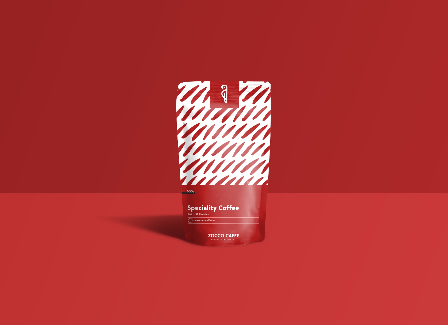
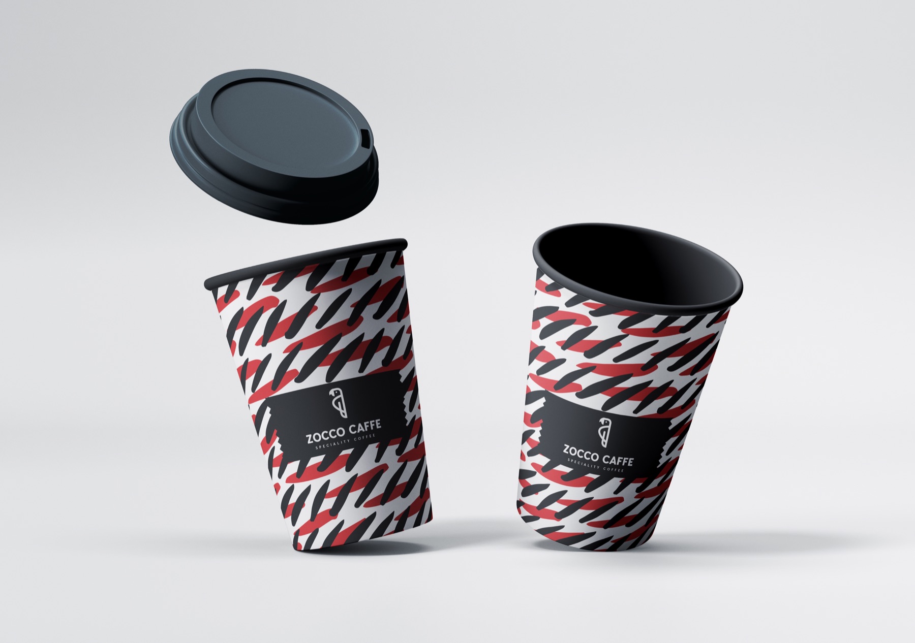
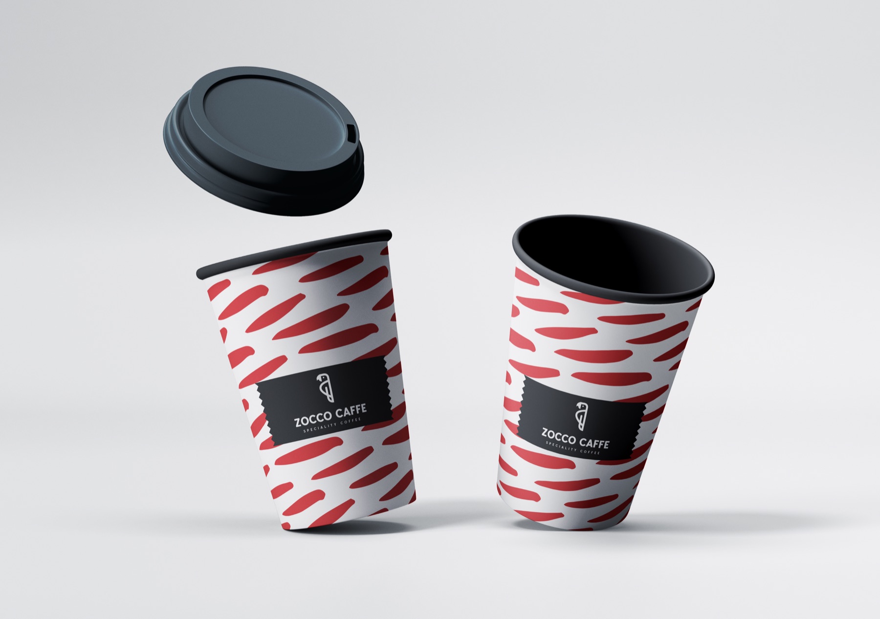
Zocco’s identity combines a distinctive symbol, direct typography and a controlled red-black-white palette with a flexible pattern language. The delivered system demonstrates how the brand can remain coherent from a coffee pouch on the shelf to a cup carried through the city. No commercial performance claims are presented without validated client data.