Engineered Mark
The compact symbol is constructed from interlocking strokes with an orange point of focus. Its geometry feels structural, technical and easy to recognize at both corporate and operational scales.
A disciplined corporate identity system designed to carry an engineering and construction brand from executive communication into the realities of fleet, safety equipment and active worksites.
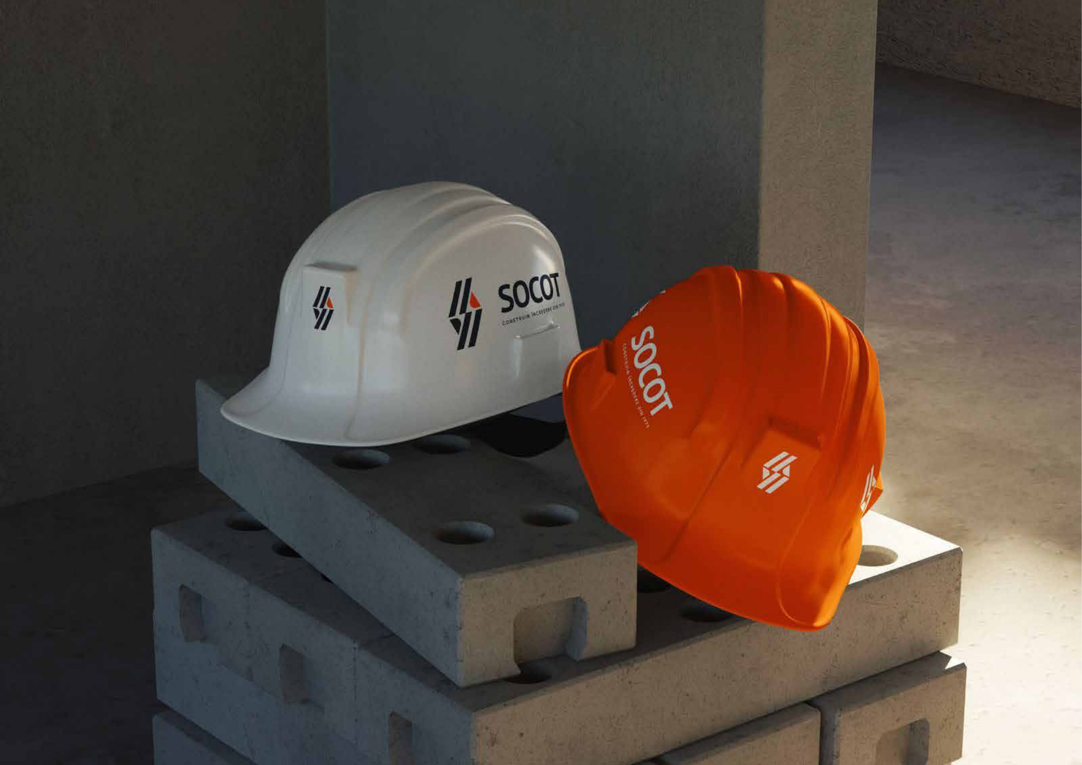
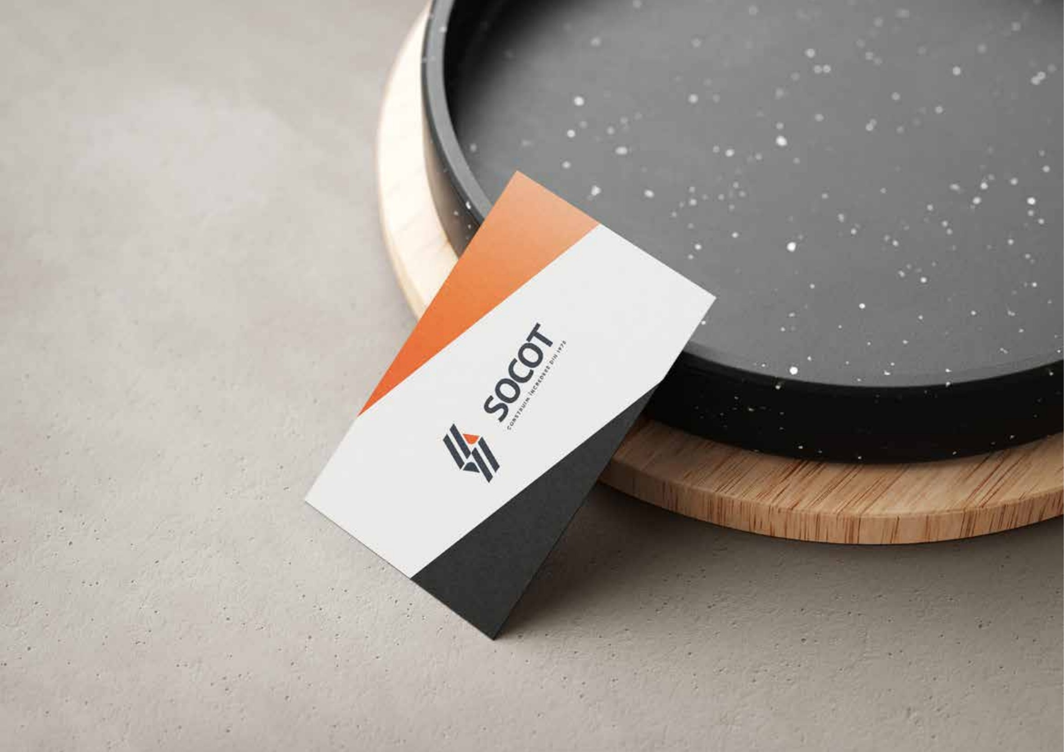
KADD developed a complete visual system for SOCOT, built around a distinctive logo, a disciplined slate-and-orange palette and rules that remain practical across office communication, publications, safety equipment, fleet and construction-site materials.
Related KADD serviceSOCOT needed an identity that could communicate trust, precision and operational confidence without becoming cold or generic. The system had to feel credible in formal corporate contexts while remaining immediately recognizable in the field.
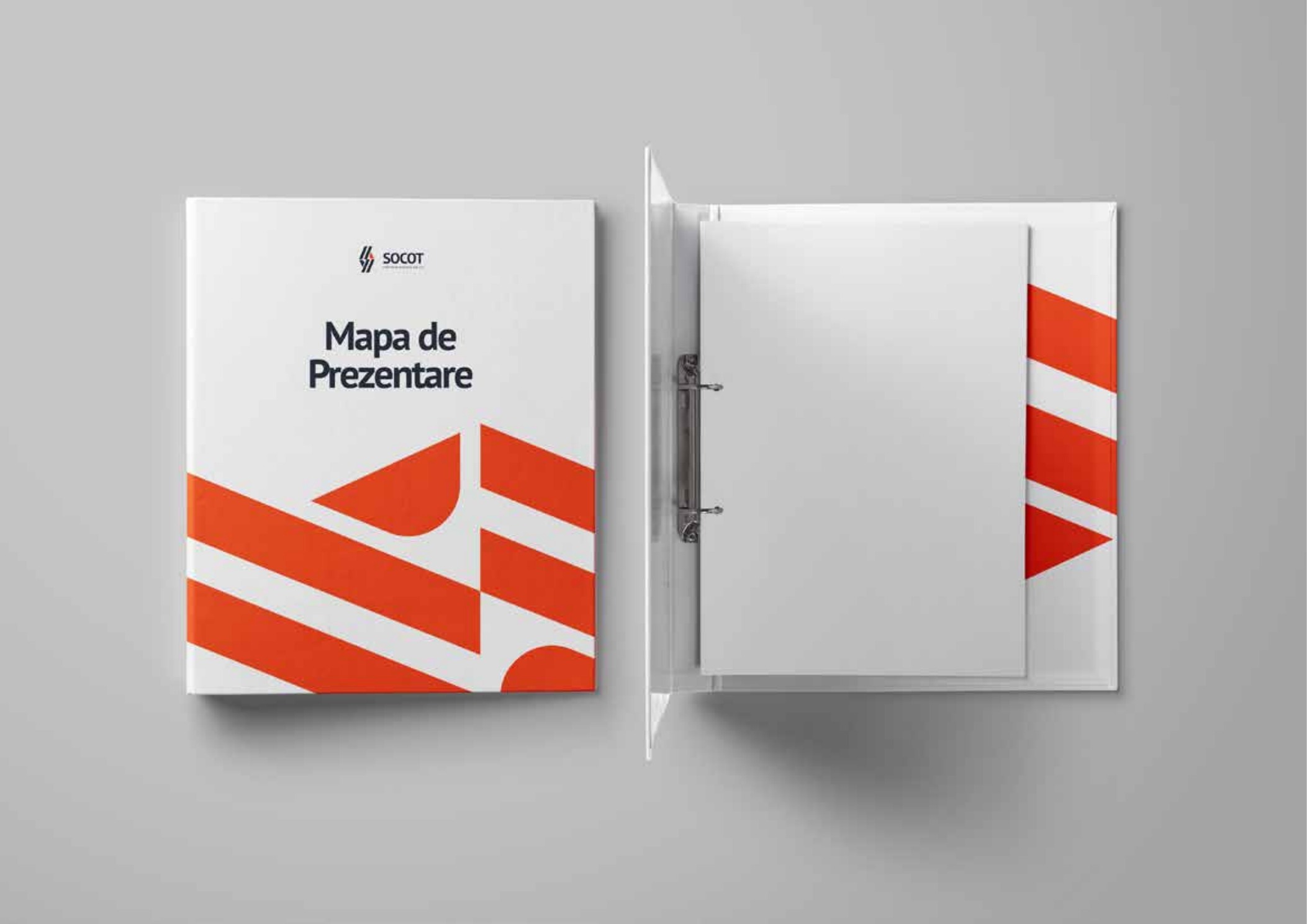
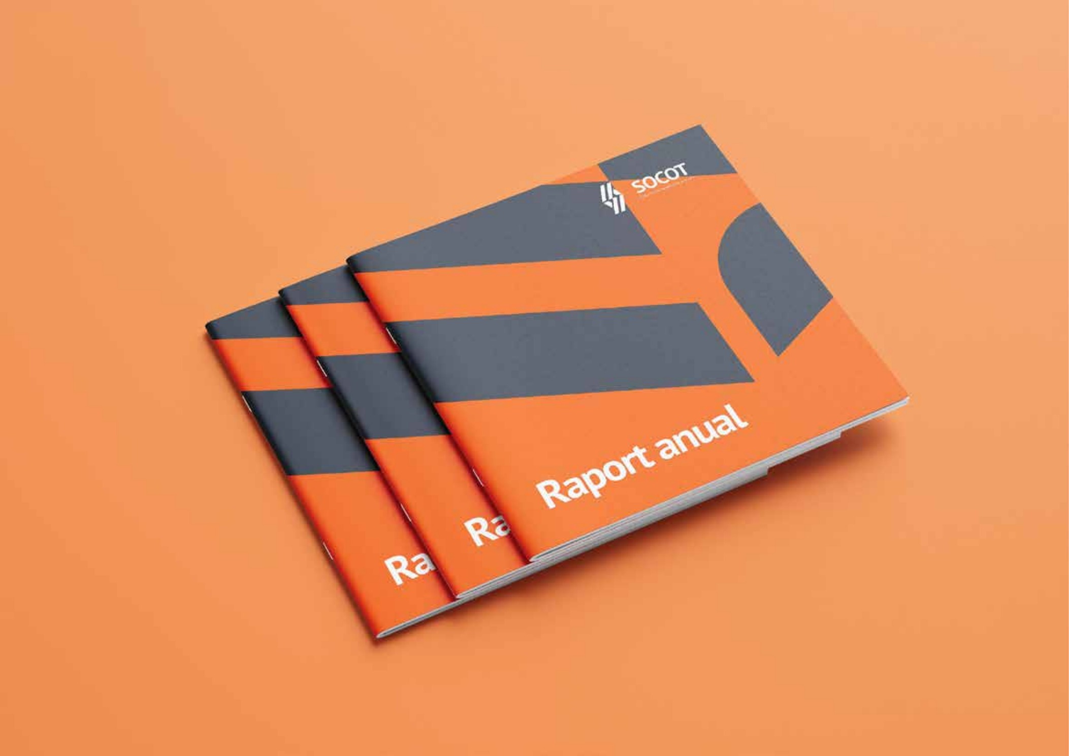
The practical challenge was scale. The same brand had to work on a business card, letterhead and newsletter, then retain clarity on presentation folders, reports, protective helmets, company vehicles and construction-site signage. Every application required a robust hierarchy and production-aware rules.
The identity is reduced to a few strong components that can survive real production conditions. The logo provides the structural signature; the colour contrast provides hierarchy and visibility; PT Sans keeps communication direct and legible.
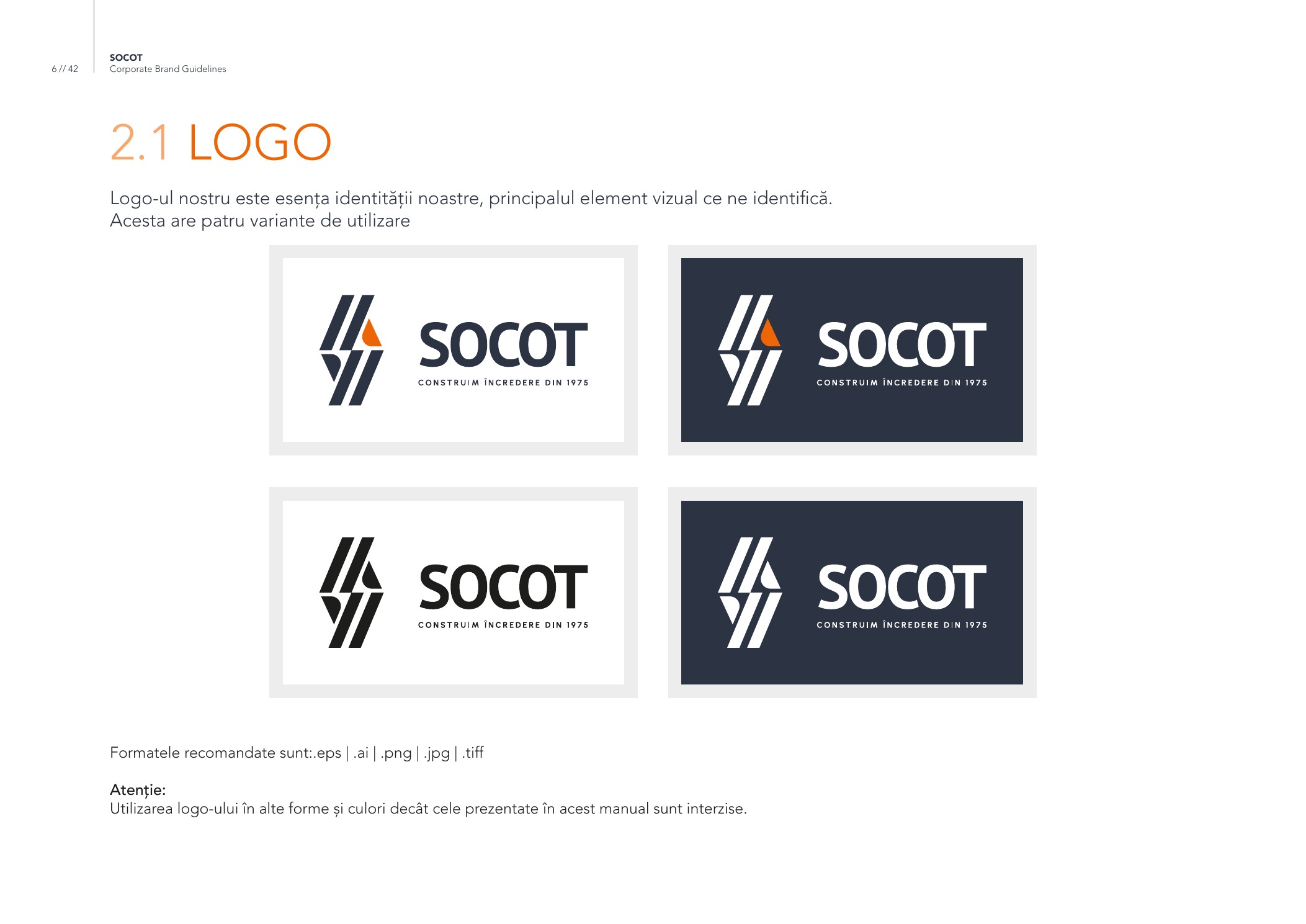
Positive, reversed and monochrome variants preserve recognition across light, dark and production-limited surfaces.
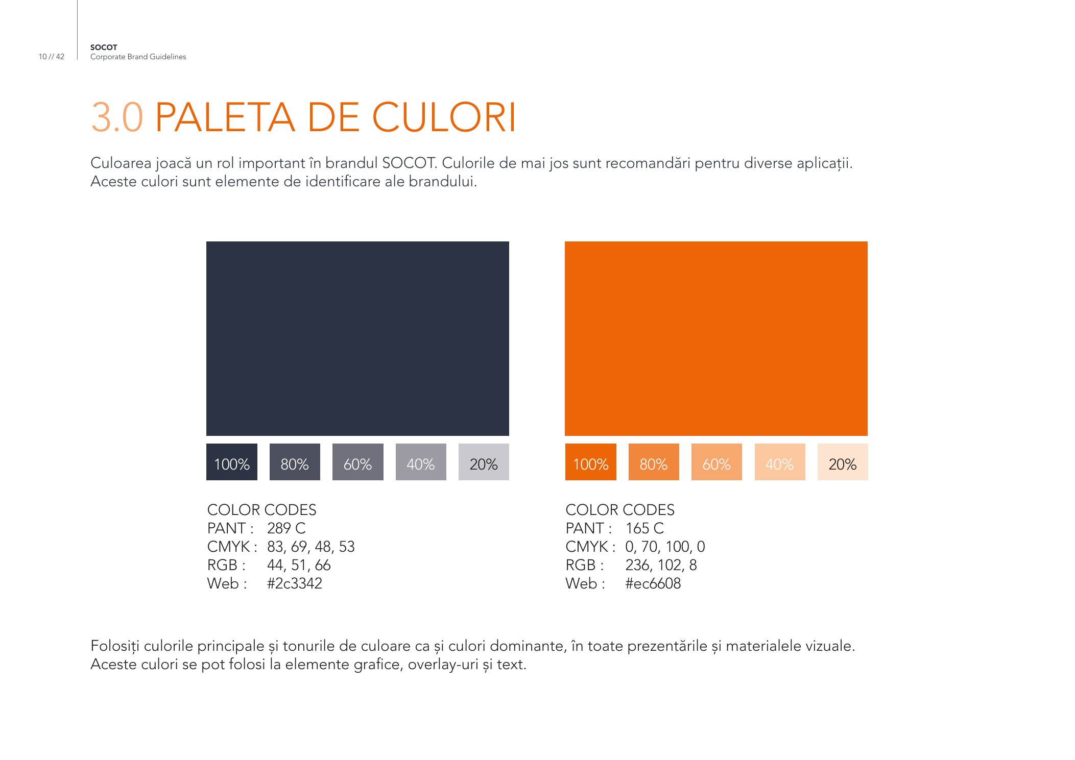
Slate #2C3342 anchors the brand in stability; orange #EC6608 creates energy, contrast and operational visibility.
The compact symbol is constructed from interlocking strokes with an orange point of focus. Its geometry feels structural, technical and easy to recognize at both corporate and operational scales.
Deep slate communicates stability and authority, while technical orange brings energy and safety-grade visibility. Together they create a distinctive system without unnecessary decoration.
The identity was tested across the surfaces that matter to the organization: documents, publications, equipment, fleet and construction environments — not only within a presentation.
Angular fields derived from the mark create a recognizable graphic rhythm. The system can become restrained for formal documents and more assertive for presentation and publication covers.
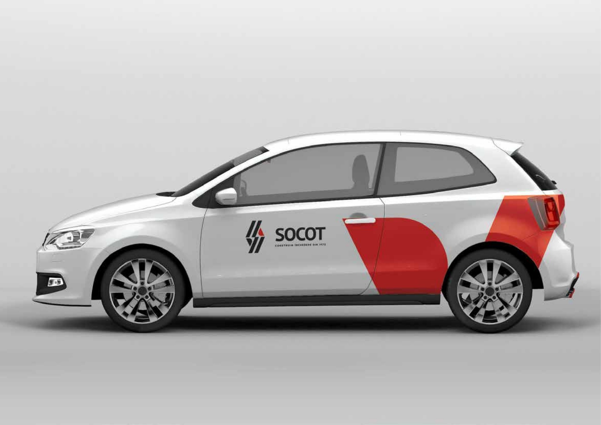
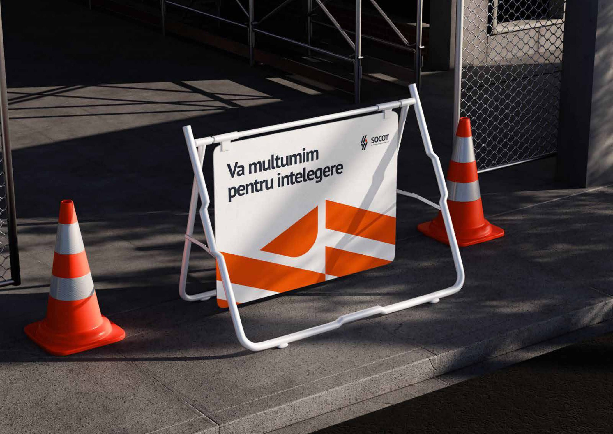
For an engineering and construction organization, the operational layer is central. Vehicle livery and site signage use the same contrast, geometry and spacing rules as the corporate materials, so recognition does not depend on one format.
The completed brand book translates the identity into clear rules and representative applications. Logo, colour, typography, stationery, publications, protective equipment, fleet and site materials now share one visual logic. The public case study presents the delivered system without unsupported commercial-performance claims.