A Peak as Promise
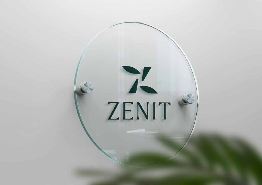
The Zenit name and angular symbol translate the idea of reaching the highest point — both geographically and emotionally — into a compact, distinctive identity.
A complete hospitality brand for a private mountain-cabin retreat where intimacy, wellbeing, premium comfort and nature meet.
KADD worked on brand strategy, visual identity & guest touchpoints for a client in the hospitality & mountain tourism sector. The project connected strategic clarity, practical implementation and a coherent customer experience for the organization’s market and location.
Related KADD services
Zenit Cabins was conceived as an intimate mountain sanctuary for couples — a place to escape urban pressure, reconnect with nature and rediscover time together. The brand needed to express this emotional promise without falling into the visual clichés of rustic tourism.
The identity also had to work as a complete guest system. From the logo and typography to vouchers, printed folders, promotional leaflets, social communication and on-site signage, every touchpoint needed to balance privacy, contemporary luxury, sustainability and a strong sense of place.
The Zenit name and angular symbol translate the idea of reaching the highest point — both geographically and emotionally — into a compact, distinctive identity.
Deep forest green, mineral white and a fresh botanical accent create a premium natural palette that feels calm and contemporary rather than conventionally rustic.
The system was designed across stationery, brochures, vouchers, promotional materials, room details and wayfinding so the experience remains coherent before, during and after the stay.
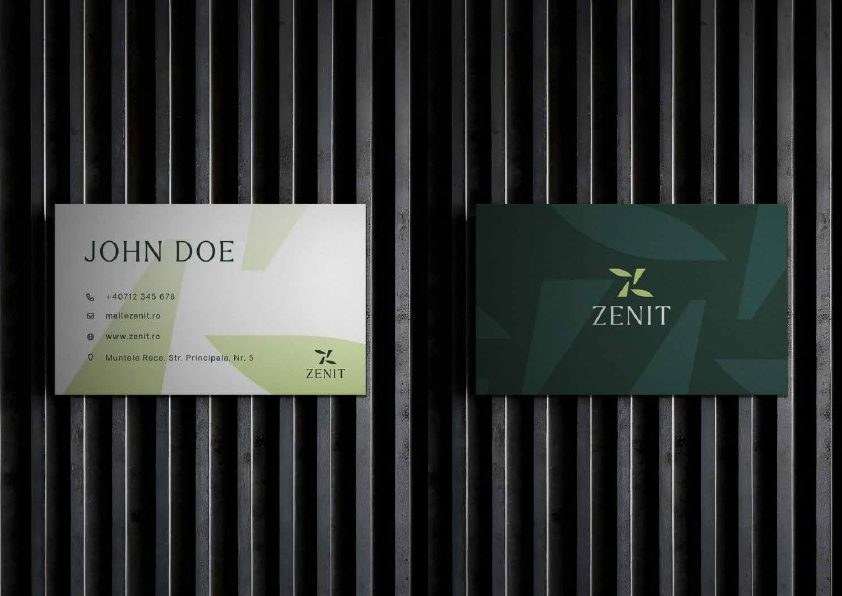
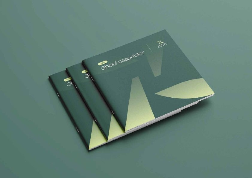
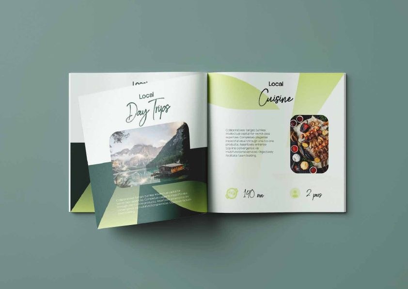
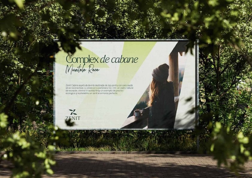
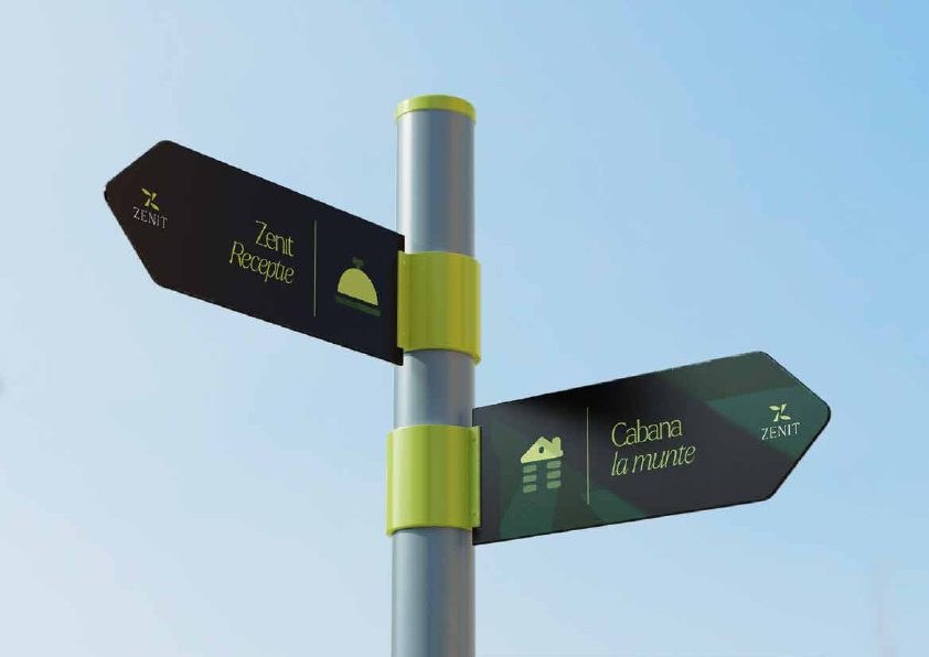
The supplied brand book translates the strategic idea into practical rules and real applications. Logo, colour, typography, print, promotion and signage now work as one recognizable experience, ready to support the cabin complex from first discovery through the on-site stay. Commercial performance claims are not presented without validated client data.