Crama Maier — Branding
A complete brand and ecommerce system rooted in the Aiud terroir, family heritage and a forward-looking vision for Transylvanian wine.
CASE STUDY SUMMARY
A premium wine brand shaped from the Aiud terroir and the Maier family story.
KADD developed the strategic and visual foundation of Crama Maier: positioning, archetypes, mission, values, story, voice, slogan, logo, identity rules and an application system extending into labels, print, digital communication, advertising and ecommerce.
Related KADD servicesThe Challenge
Turning family ambition and a distinctive terroir into a premium wine brand.
Crama Maier needed more than an attractive mark. The new identity had to create a credible anchor in Romania’s competitive premium-wine category, express the character of the Aiud terroir and give the founding family a distinctive story that could be recognized, described and carried across every touchpoint.
The strategic task was to connect heritage with progress: preserve the family’s relationship with the land and Transylvania’s winemaking tradition while creating a contemporary system capable of supporting wine ranges, hospitality, communication and direct ecommerce.
BRAND ARCHITECTURECreator by craft.
Creator by craft.
Explorer by spirit.
The archetype system gave the brand a consistent decision filter. Creativity, mastery and originality lead the identity; curiosity, courage and discovery keep it open, human and experiential.
A brand built from place, personality and a clear promise.
Strategic Anchors
The process began with three factual anchors: Aiud and its viticultural tradition, the Maier family story, and the ambition to create a premium product and experience rather than compete through volume.
Creator + Explorer
A 70% Creator and 30% Explorer archetype mix shaped a brand that values craft, originality and excellence while remaining curious, courageous and open to discovery.
Roots for the Future
The visual and verbal system joins tradition with progress. The slogan “rădăcini pentru viitor” turns this balance into a concise promise that can guide both identity and communication.
PLACE & PURPOSE
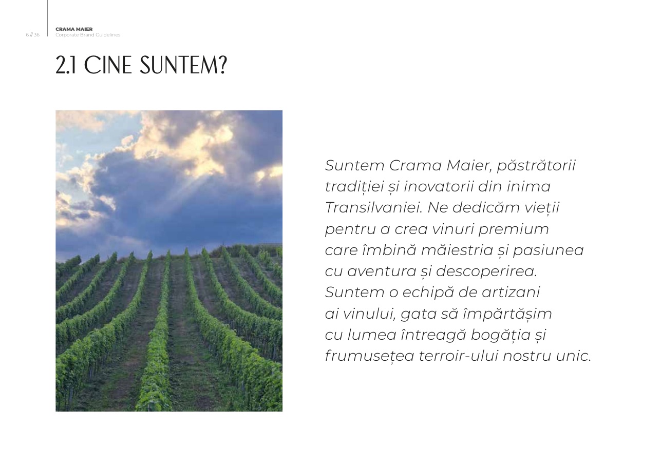
The story begins in Aiud.
The source material identified Aiud, its viticultural heritage and a distinctive terroir as the brand’s geographic foundation. The family story adds a human center: Nina and Gilu Maier’s ambition, the continuity of a new generation and a commitment to wines that express both place and personality.
“Păstrătorii tradiției și inovatorii din inima Transilvaniei.”
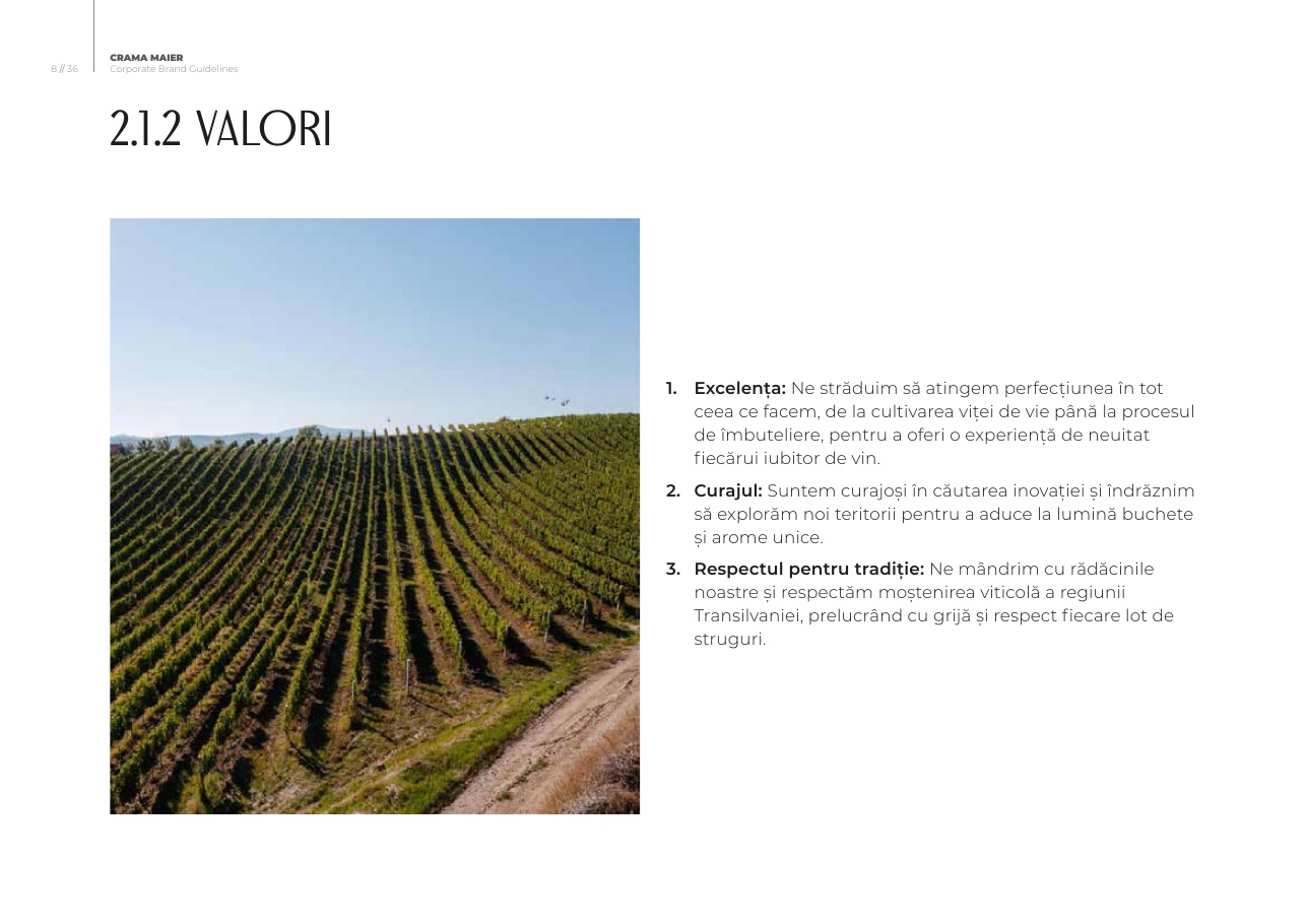
Three principles connect vineyard, product and experience.
Excellence
Rigour from cultivation through bottling, in service of a memorable wine experience.
Courage
A willingness to innovate and explore new expressions, bouquets and territories.
Respect for tradition
Care for Transylvania’s viticultural inheritance and for every lot of grapes.
THE BRAND PROMISE
Rădăcini pentru viitor.
A concise expression of stability, growth and continuity: a solid foundation in family and winemaking tradition, paired with an ambition to innovate and progress.
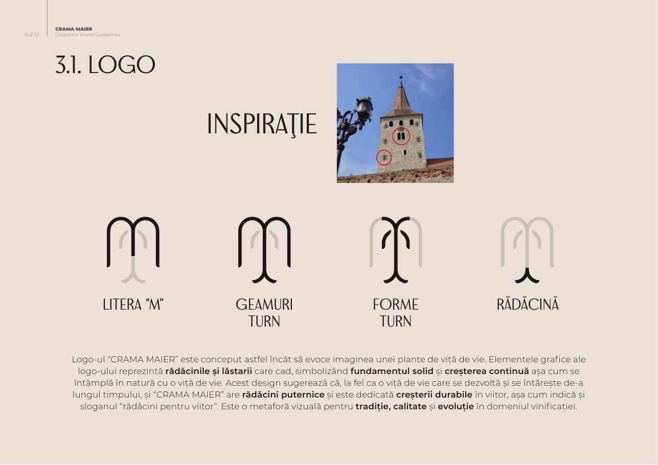
A symbol where the letter M, local architecture and the vine meet.
The mark was developed from the letter M, tower-window forms and the organic language of roots and shoots. Its symmetry makes the identity feel architectural and premium, while the descending and rising forms express continuity and growth.
Brand ResearchCompetitive ContextBrand PositioningAudience DefinitionBrand ArchetypesMission & ValuesBrand StoryTone of VoiceSloganLogo SystemVisual IdentityColour SystemTypographyWine Label ConceptsPrint ApplicationsDigital GuidelinesAdvertising SystemVehicle LiveryCustom Website DesignEcommerce Experience
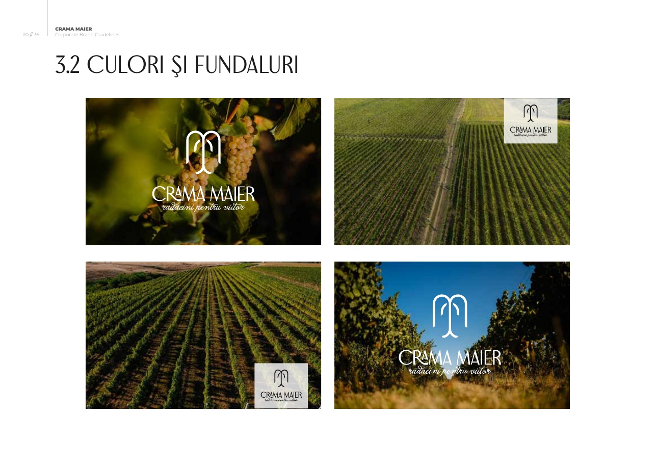
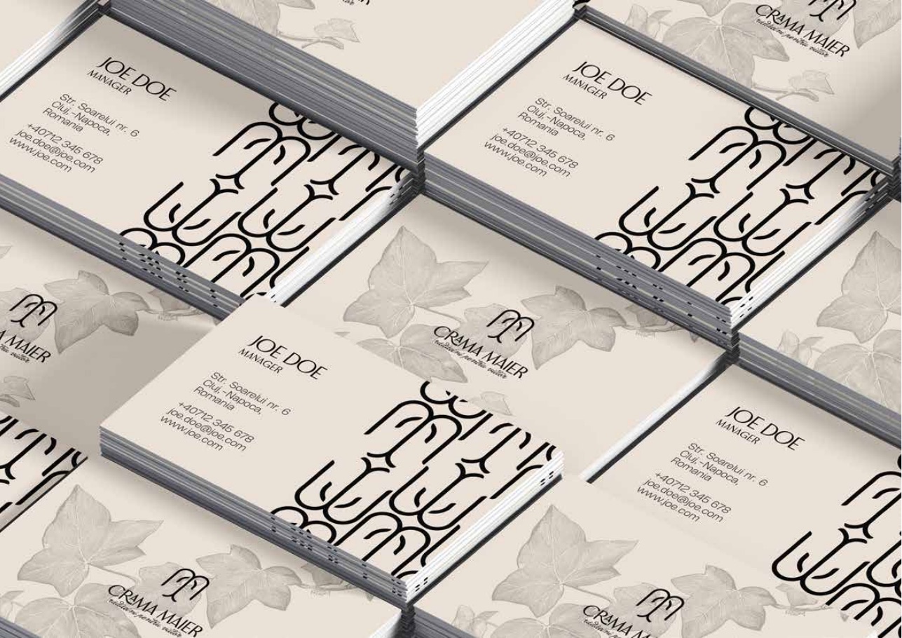
Designed to remain recognizable from bottle to billboard.
The brand book converts strategy into rules and working examples for physical and digital production.
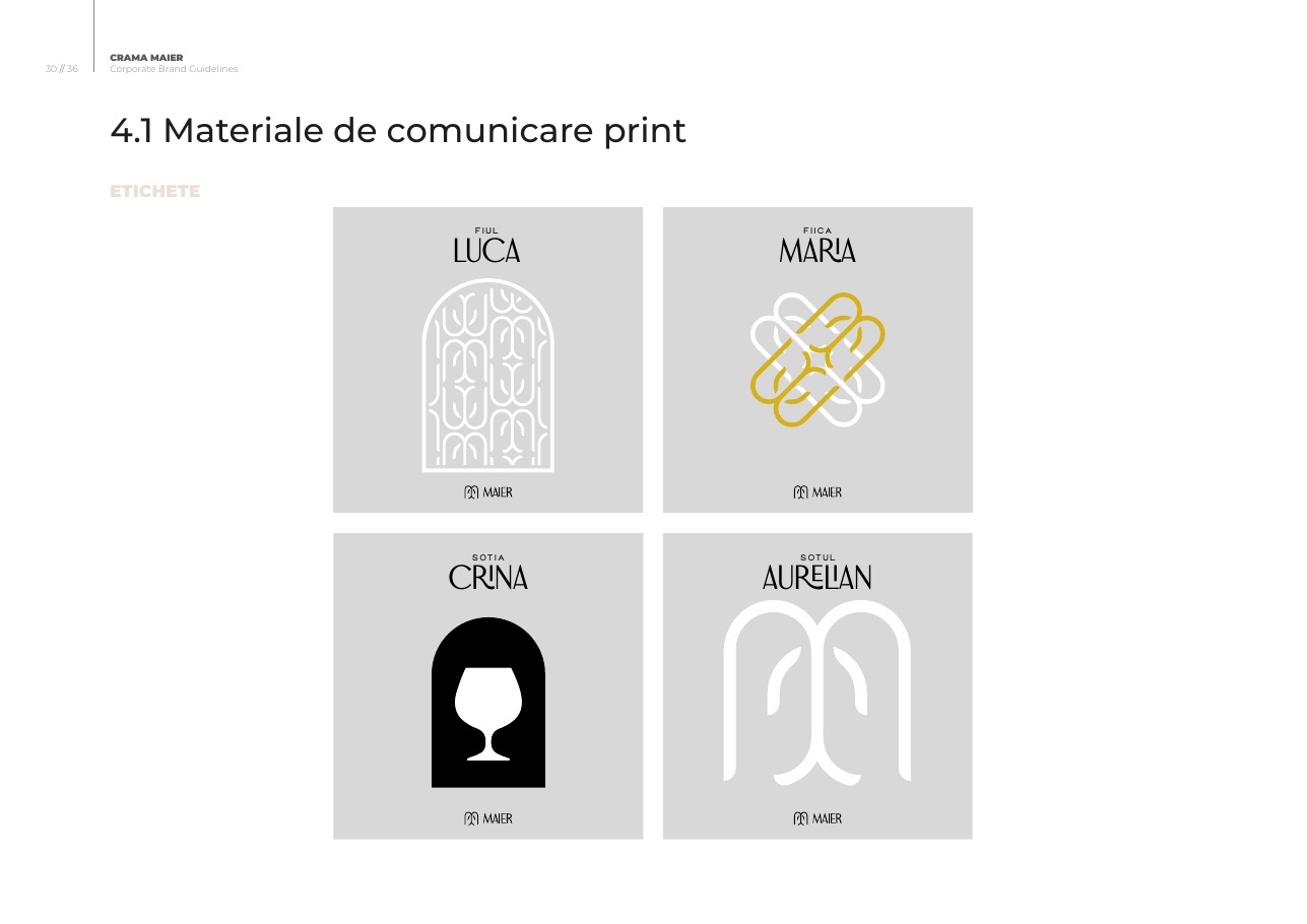
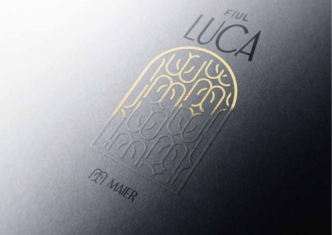
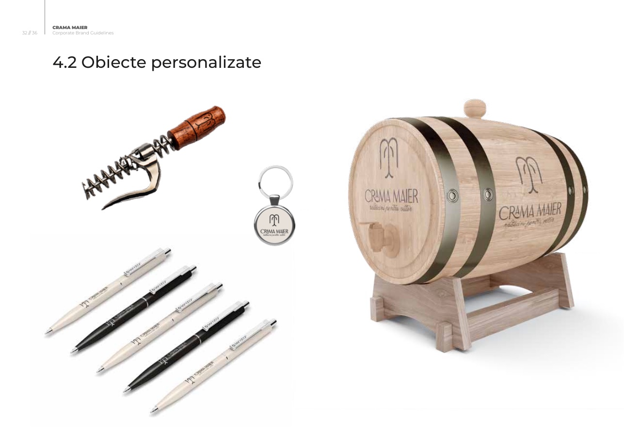
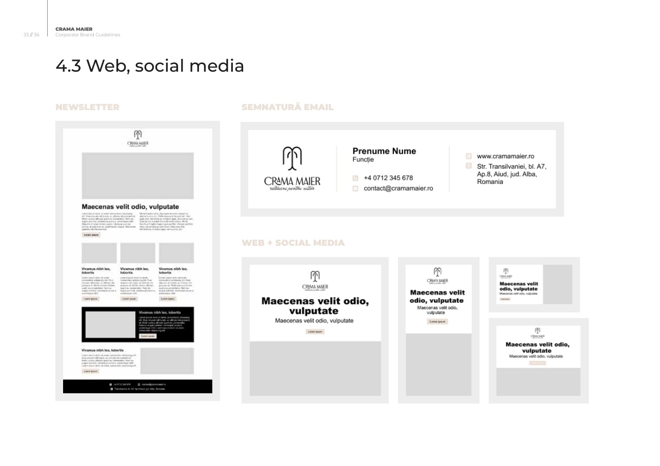
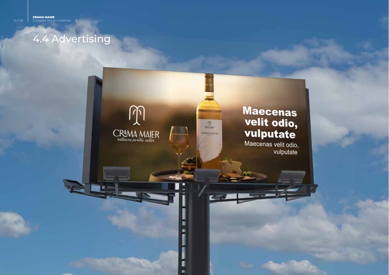
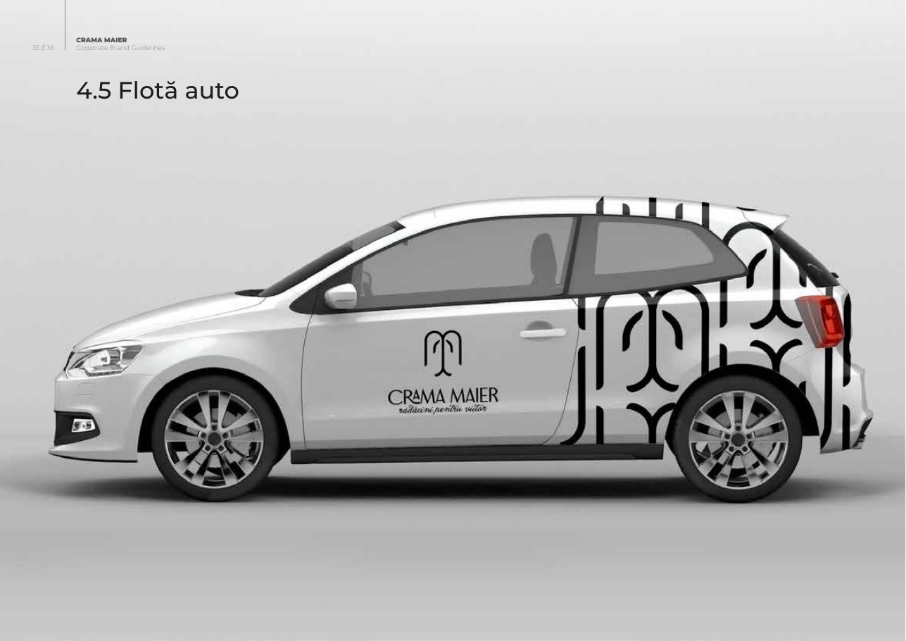
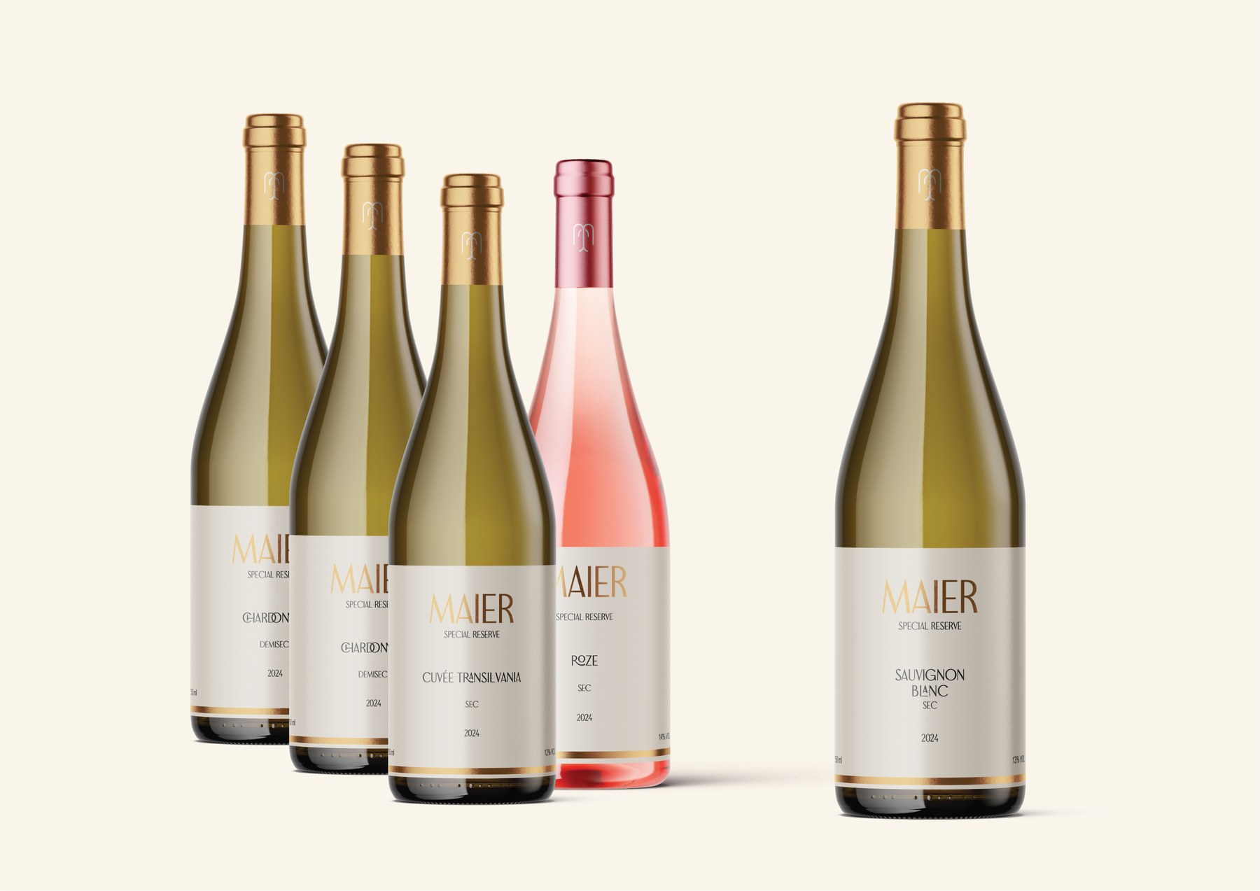
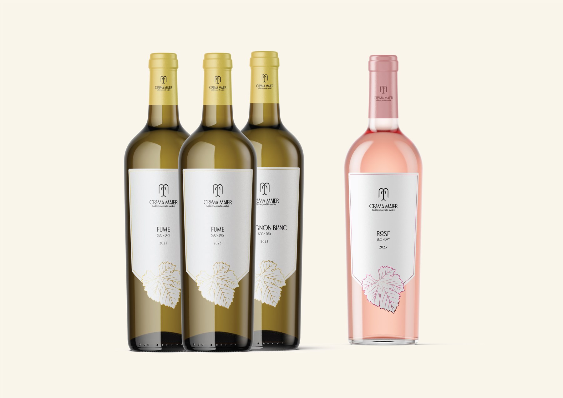
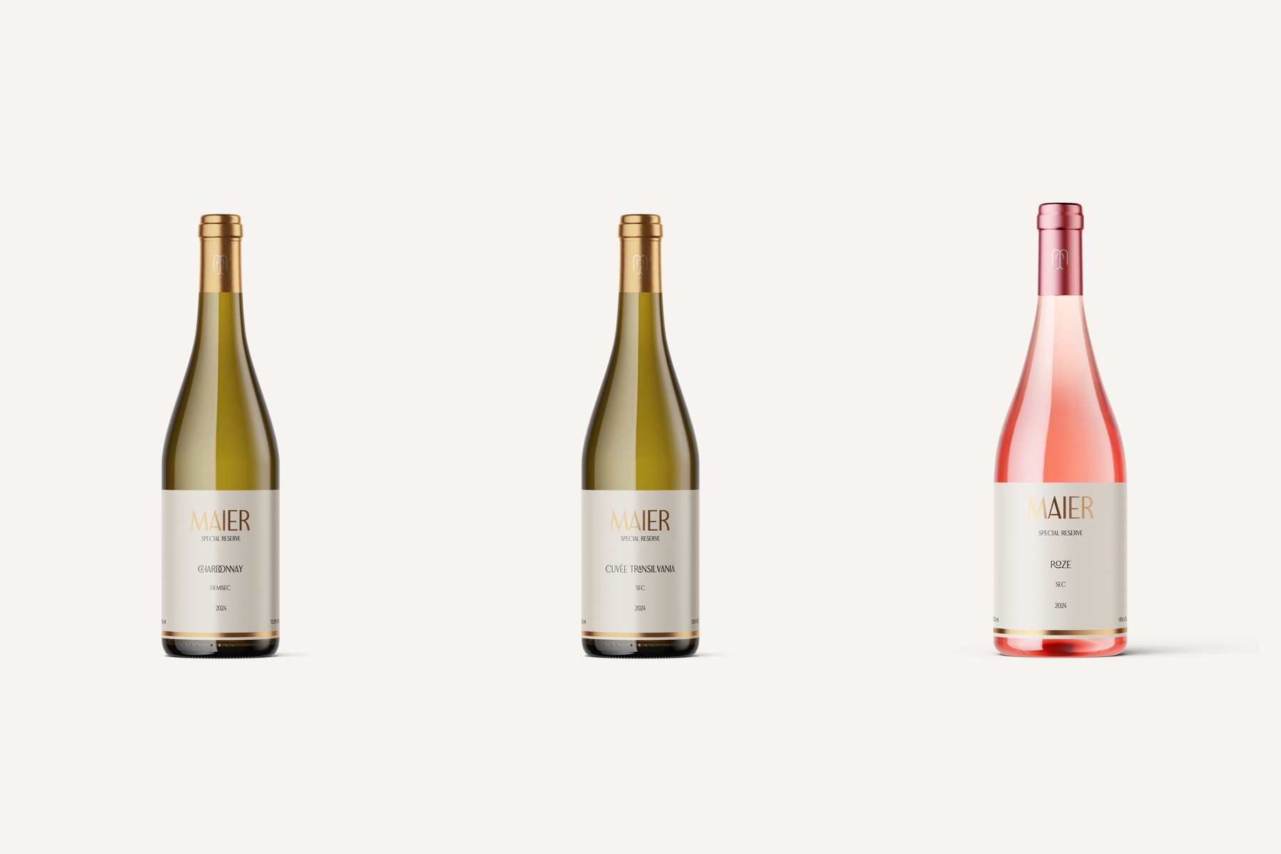
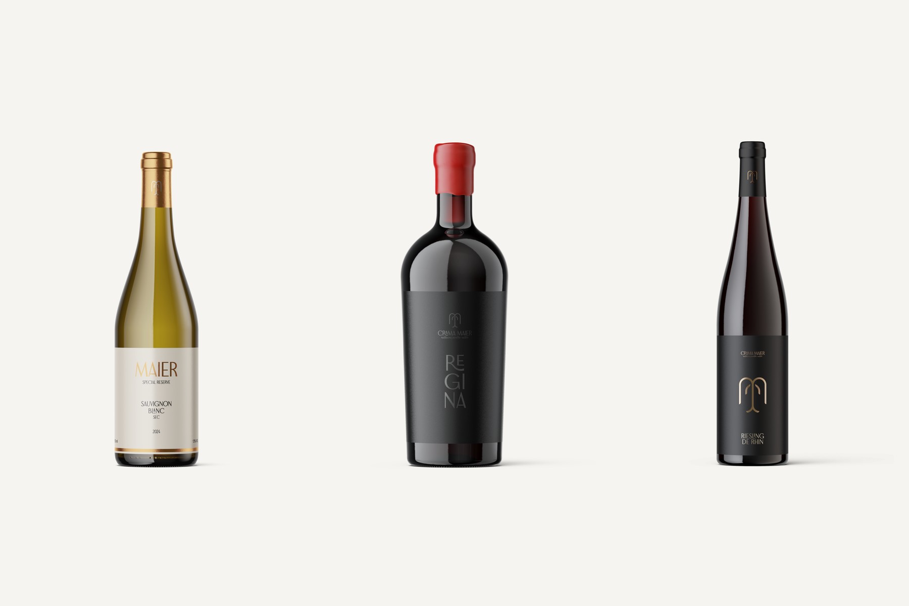
A coherent label architecture across retail, reserve and premium wines.
The identity was extended into practical bottle and label systems, balancing family resemblance with clear differentiation between ranges and varieties.
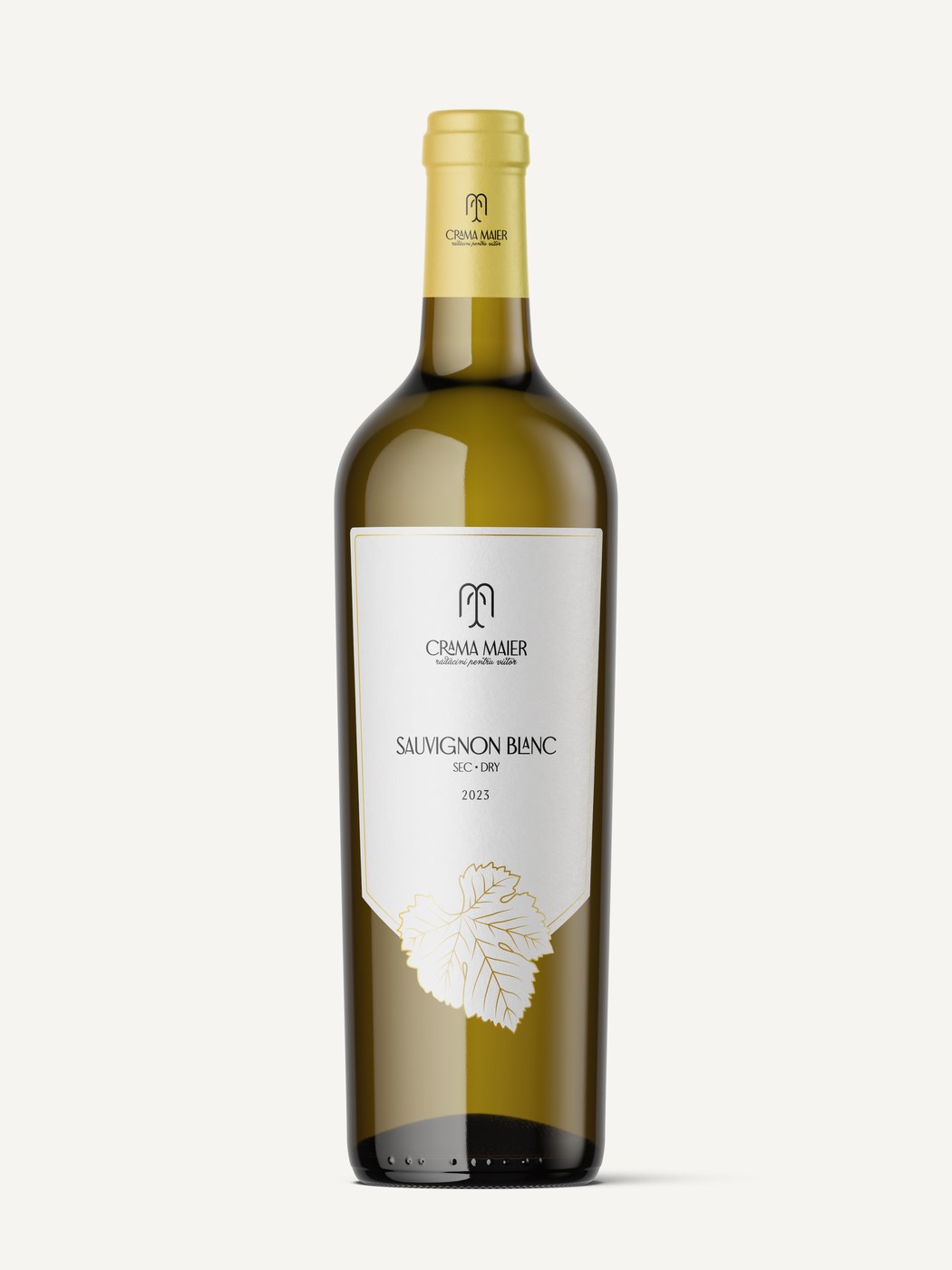
FROM BRAND TO EXPERIENCE
The identity continues into a custom ecommerce platform.
The separate website case study documents how Crama Maier’s story, wine portfolio and direct-to-consumer journey were translated into a responsive digital experience.
View the website case study↗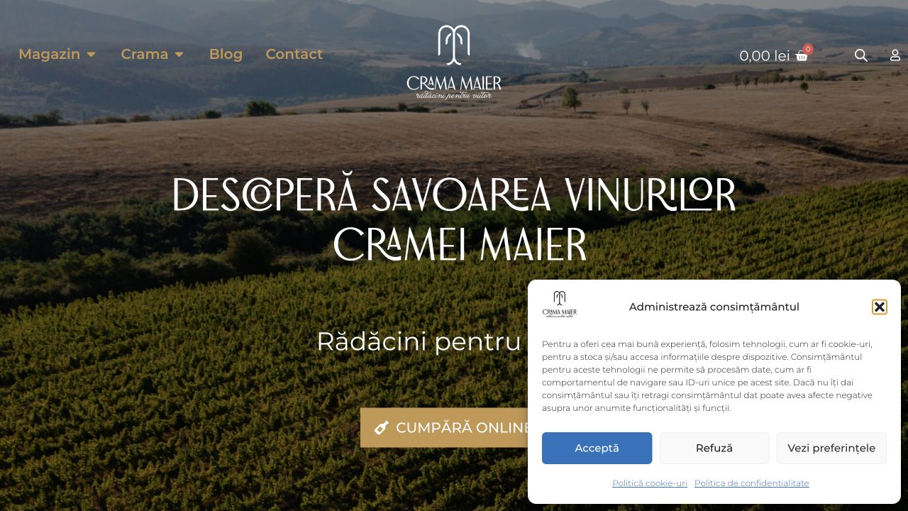
The Outcome
One coherent identity, from vineyard story to customer experience.
Crama Maier gained a strategic and visual foundation designed to grow without losing its roots.
The completed system translates the Aiud terroir, the Maier family and the brand’s Creator–Explorer personality into a consistent identity. Logo, language, colour, typography, labels, print, digital communication, advertising and ecommerce now share one recognizable logic. The public case study documents the delivered system; commercial performance claims are not presented without validated client data.
Editorial source: Crama Maier research and creative-process presentation · Crama Maier Brand Book 2024 · Case study prepared by KADD